- Introduction
- Structure of blogpost
- Slides 1
- Slides 2
- Slides 3
- Slides 4
- Slides 5
- Slides 6
- Slides 7
- Slides 8
- Slides 9
- Final remarks and lessons learnt
Introduction
In this post, I will describe how I turned a decent presentation into a great one. But first some context.
At the end of the Faculty Data Science Fellowship, Faculty hosts an event called ‘Demo Day’, in which the fellows each give a 5-minute presentatation to showcase what they achieved in the project. Over 300 people from the data science industry attend this event, so these presentations are a big deal. You can see many of the demo day presentations on Faculty’s YouTube channel.
Because Demo Day is important, we literally spend a whole week preparing the presentation, giving our talk to a dozen or so different people in Faculty, and iteratively improve based on their feedback.
I found this to be an insightful experience. My first draft of the presentation was decent, but it was incredible to get all the feedback on how I can improve. I find this to be a rare experience, because there is a societal norm to always be positive and avoid (constructive) criticism. (Or I just don’t know how to ask for feedback!) Furthermore, if you search online or attend a workshop on presentations, you will be shown examples of terrible presentations and told about basic things (don’t have paragraphs of text, use consistent colours and fonts, etc.). Sometimes you do get some real insights, e.g. Tim Urban’s post about how they prepared for their TED talk.
So, I hope this blogpost will be useful, and will help you improve your presentations in the future as much as it will help me improve mine.
Structure of blogpost
I will focus on the visual aspect of the presentation, i.e. the slides. For each section of slides I will:
- Show the earliest version of the section
- Provide context for the slides, by quoting roughly what I would say
- Ask you to think how you might improve the slides
- Show you different versions of the slides
- Describe what changes were made and why they were made
I strongly encourage you to really think about how you might improve the slides. You will learn more if you do this, than if you just passively read.
Slides 1
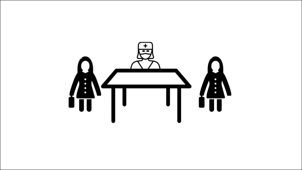
Version 1:

Context:
Suppose Mo is a surgeon at his local private hospital. He is unhappy because he feels like he is experiencing discrimination from them. So he does what any good American would do, and he sues them! Lawyers are hired to resolve the disagreement. In order for the lawyers to do their job, they need to know what the facts of the matter are, and one way to do this is to interview potential witnesses.
How would you improve the slides? This might the hardest example to think of improvements, because the slides are already pretty good, unlike many of the other slides to come.
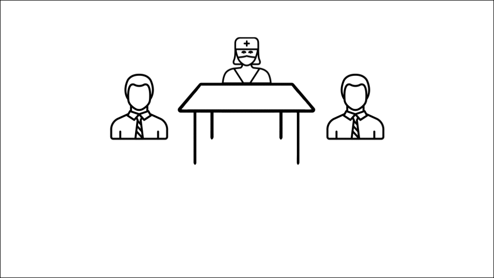
Version 2:

Changes: There are three changes here, and they were all suggested by a Graphic Designer Nadine Daouk.
- Have the icons of the lawyers match the style of the other icons
- Have thick-ish margins / white space on the outside of the slides
- Use different sizes of icons, to create ‘hierarchy’ in the slide. For me, this is the single big new idea I learnt from the whole experience. The idea is that on every slide, it should be clear what is the most important piece of information on it. In this case, Mo and the hospital are the two major people in the situation, followed by the lawyers, followed by the witnesses. That is not clear in the final slide of Version 1, but it is clear in Version 2.
Additional thoughts:
First, it was such a pleasure to watch an expert at work. I am still taken aback by how Nadine provided feedback on my presentation: for every single slide, she instantly noticed if something was off and knew precisely what to do to improve it. It really was remarkable.
Second, this idea of hierarchy is an ‘advanced’ idea. It only becomes relevant once you have removed all the basic errors (e.g. having too much information on the slide) and if there is a difference in importance in the information in the slide. Another example of hierarchy is changing the font size or colour to indicate which words on a slide are vital and which are secondary.
Slides 2
Version 1:
Context:
Each witness is interviewed one at a time. There is somebody in the room furiously typing away, and at the end of the interview a written record of everything that was said is created.
How would you improve the slides? Big hint: I will be repeating myself quite a lot!
Version 2:
Changes:
- Have the icons of the lawyers, typewriter and table match the style of the other icons
- Have margins / white space on the outside of the slides
Additional thoughts: There is going to be significant repetition in the slides, but that is the nature of these things. Lastly, in the final version of the presentation, these slides were actually cut because I had to shorten this part of the talk.
Slides 3
Version 1:
Context:
To give you a sense of what questions are asked, here are some examples. […] And they go on, and on, and on.
How would you improve the slides?
Version 2:

Changes:
- Another fellow Zoltan said that in the first version, the slides looked a bit too tidy and suggested making it look like more of a mess.
Slides 4
Version 1:

Context:
At the end of the day, the lawyers need to go through this mess of information, find out the important themes and details, and determine how to best represent their clients.
How would you improve the slides?
Version 2:

Version 3:
Changes:
- Change the icon of the lawyer
- Make the lawyer clearer to see. I made several attempts at this, and each time it was a consistent piece of feedback that it was hard to see. Looking at the final version now, I could have had a few words above the lawyers, to maintain the effect of the lawyers being swamped by all the information.
Slides 5
Version 1:
Context:
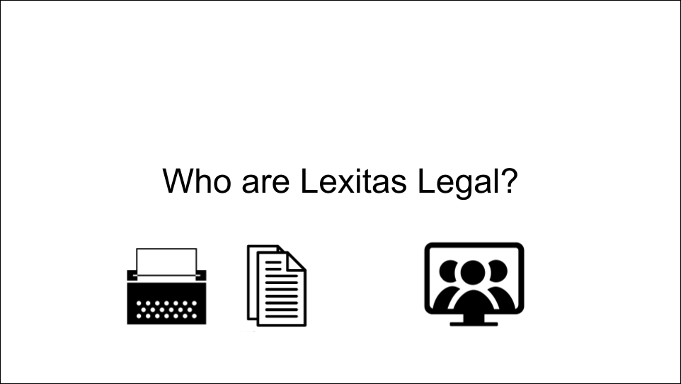
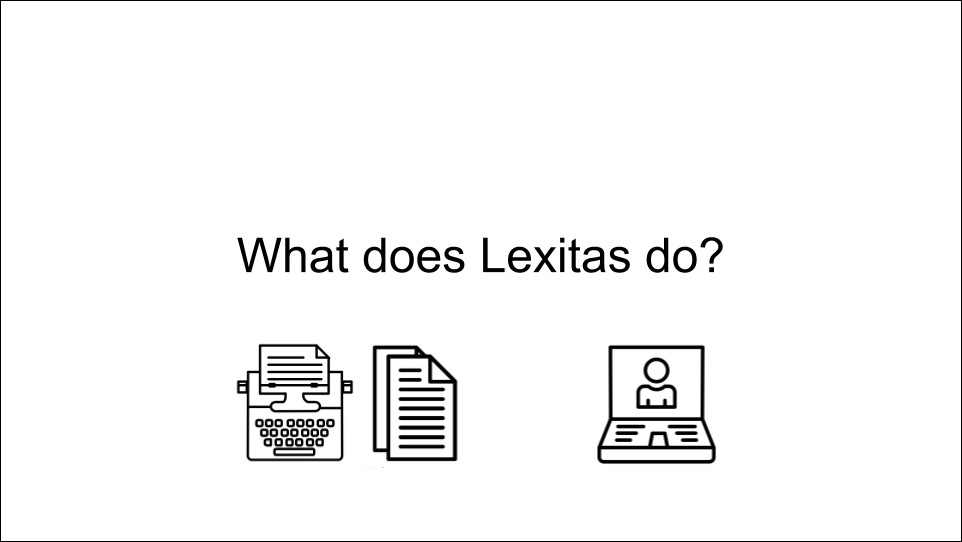
Who are Lexitas Legal. Simply put, they provide services to make lawyers’ lives easier. E.g. they provide the tools and expertise to create the written records, or the tools to do online depositions.
How would you improve the slides? Based on previous slides, you should be able to give some improvements!
Version 2:
Changes:
- Change the icons to match the style of other icons in the slides
- Change the phrasing of the title and the slide. These slides came after the explanation about depositions. Maria Diaz noticed that this felt a bit jarring - and I agreed. However, to understand what Lexitas does, you first have to understand what a deposition is. The compromise I came up with is that instead of saying ‘Who are Lexitas Legal’, I would say ‘So how does Lexitas fit into all this?’. This created a smoother transition.
Slides 6
Version 1:
Context:
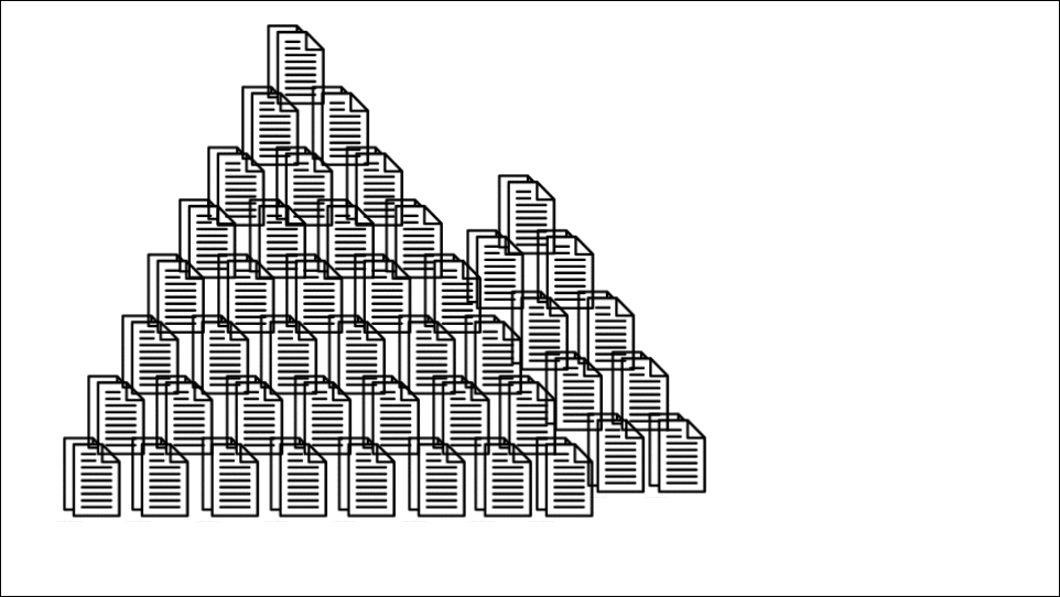
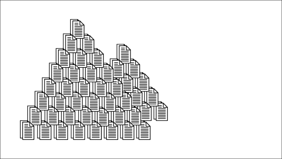
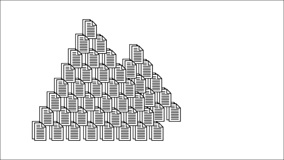
Lexitas is sitting on mountains of transcripts. They wanted to know if there were any nuggets of gold hidden within and if data science was the right tool to find it. The short answer is ‘Yes!’
How would you improve the slides? I suspect many of you will be able to point out some ways to make it better.
Version 2:
Changes:
- Elliot Christou pointed out how the transparency of all the icons made the mountain of transcripts look very untidy. I made them non-transparent, and also tidied up the mountain so the spacing was uniform.
- Nadine Daouk said the nugget of gold was small and should be made more prominent.
- And as for many of the previous slides, I adjusted the spacing to include a margin / white space around the outside of the slide.
However, this was not the final version. Here is the final version:
Changes:
- Following the incredibly insightful advice of expert story-teller Jonny Howell, I removed the forced metaphor of the California Gold Rush and references to nuggets of gold, and used the phrase ‘hidden value’ instead. However, as a result of removing the explicit verbal references to gold, my technical mentor Sania Jevtic thought that gold nugget was actually a boxing glove punching its way through the mountain of transcripts! This is definitely not what I wanted, so following their suggestion, I replaced it with a pot of gold.
- Caroline Ames made the suggestion of adding some text to these slides. I think it is nice to fill in the white space, and also emphasise the question.
Slides 7
Version 1:
Context:
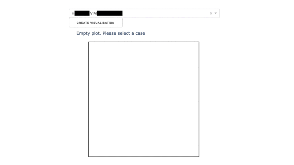
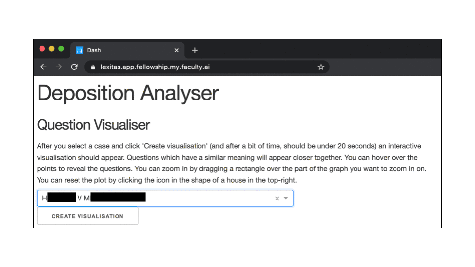
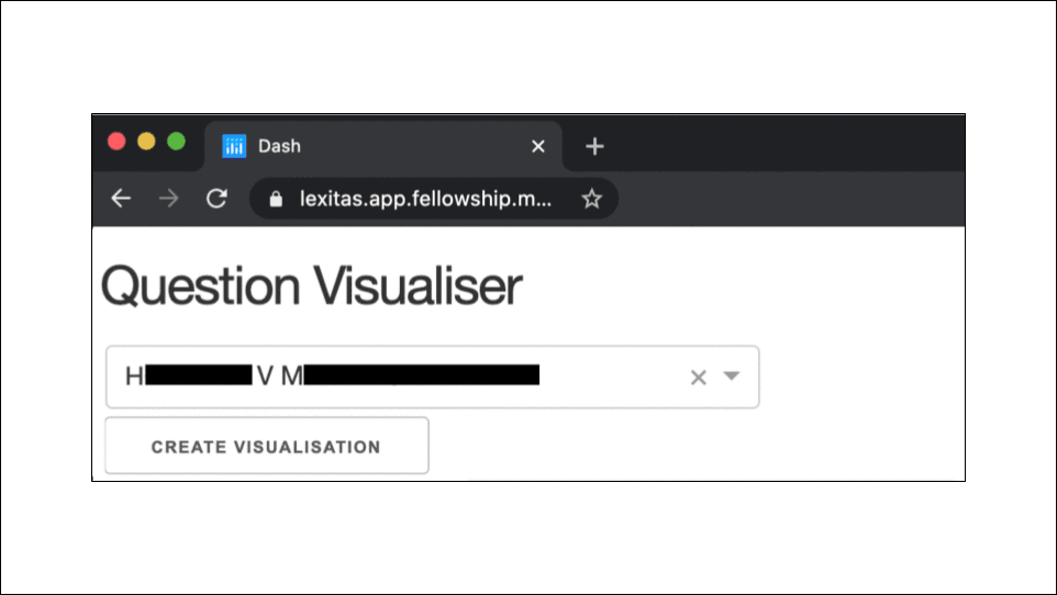
This app I created visualises all the questions in a deposition. You select a case, hit the button, and out pops this visual. Each dot represents a question and similar questions are grouped together. This is an interactive visual so as you move your mouse over the dots, the question is revealed. If you hover your mouse over this clump, you’ll see they are all about complaints on working conditions. Another example is that this cluster is all about emails.
How would you improve the slides? As a hint, how would you make it clearer that these screenshots are from a web-app?
Version 2:
Changes:
- The biggest change was to have the first screenshot include the web browser, to make clear that this was an app. This was suggested to me by Nadine Daouk and Josh Muncke. (Actually, Josh suggested I get an image of a laptop with a blank screen and put the app within the laptop’s screen. This was too fiddly for me, and I think what I did by screenshotting the browser works nicely.)
- A few other cosmetic changes, all due to Nadine, were to make the arrows horizontal, make the arrows black, and to make sure the plots aligned from slide to slide. (In Version 1, there is a small change between slides 3 and 4).
Once again, this was not the final version:
Version 3:
Changes:
- I cut out some slides. This is because I had to streamline the slides as they were too long.
- Savina van der Straten Waillet said that I rushed through the app. My solution to this was to remove all the words from the slide with the app, as I assumed that they (and presumably other people) would try to read what was there.
- Tidied up the redaction boxes. This is something I noticed myself. After paying attention to details for so long, you start to notice things by yourself!
Slides 8
Version 1:
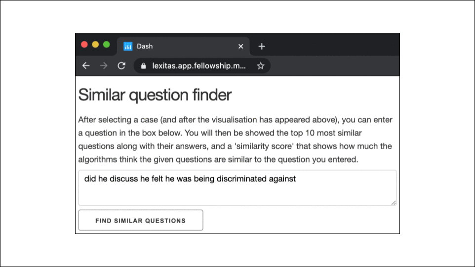
Context:
A second app I created is a Similar Question Finder. A lawyer enters any question they are interested in, hits the button, and the app will output all the questions, along with their answers, that are most similar. […]
How would you improve the slides?
Version 2:
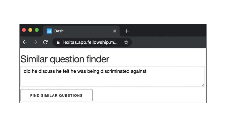
Changes:
- Like for the first app, I removed the text from the screenshot of the app.
- I resized the window of the app to make it fit nicer into the page
- I trimmed out a lot of content, due to time restrictions
- I tidied up the red boxes
Slides 9
Version 1:
Context:
The next slide is for the more technical members of the audience, and gives list of main tools used to create the app […]
How would you improve the slides?
Version 2:
Changes:
- Most people did not comment on these slides, but Caroline Ames suggested creating a flowchart so that even people without any technical knowledge can get some vague sense of the process.
Additional thoughts: Though the new version is aesthetically nicer than the old version, in retrospect, I actually think the old version was more appropriate given my script and my time limitation. This is an interesting situation where the flowchart has the potential to create a better presentation, but it is harder to make it work.
Final remarks and lessons learnt
I hope these examples were insightful for you, that it will help you improve the quality of your slides. I should say that this is only a sample of the changes that were made. E.g. I experimented with adding background colour, but a white background felt the best in the end.
The main lessons I learnt from this experience:
- Think about ‘hierarchy’. Make clear which information is the most important in a slide.
- Have margins / white space around the outside of slides. More importantly, use the gridlines functionality to do this.
- Finally, and most important of all, get feedback from a wide range of people. Different people notice different things, and all their little contributions add up to considerable improvement.
Comments, suggestions, or thoughts are highly welcome! In particular, I would be interested to know if you have any different ideas on how to improve the slides.