Using Data Science to Create Art
While trying to find the best clustering of some text data, I unintentionally stumbled upon some visually striking plots, which I think are highly aesthetic and artistic.
Introduction
While working with Lexitas to process deposition transcripts, I was trying to find the best tools and settings to visual clusters of questions. Several of the choices lead to visually striking plots. I was pleasantly surprised by this. My mentors enjoyed looking at these, so I figured other people mght like them as well.
How the art was created
The dataset was a list of questions taken from a single deposition transcript. Importantly, and surprisingly, all the images to follow are all representations of this same dataset.
I then vectorised the sentences using various tools (e.g. tfidf and glove vectors) and did dimension reduction using either tSNE or UMAP. I then plotted the resulting data using Bokeh.
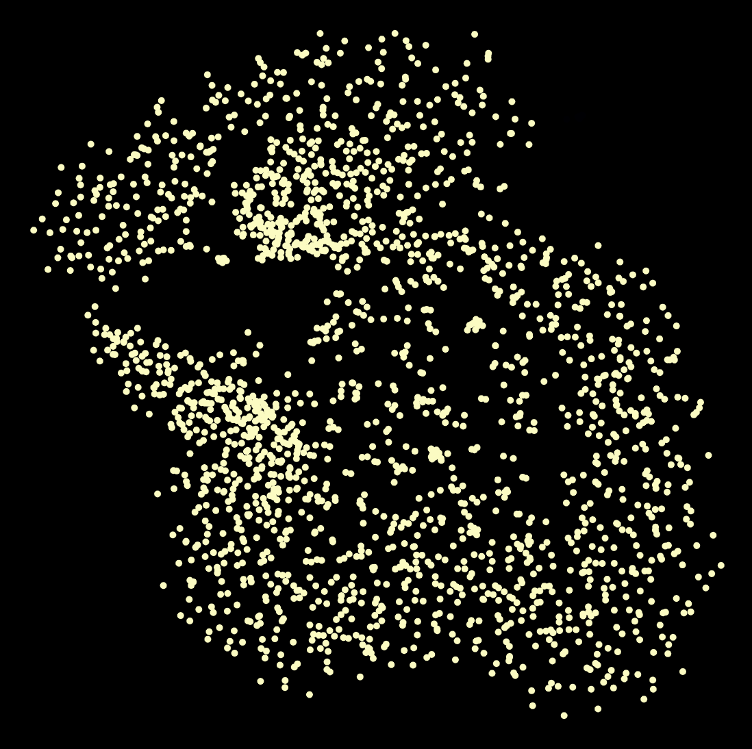
The art
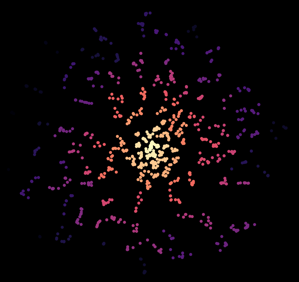
The Firework
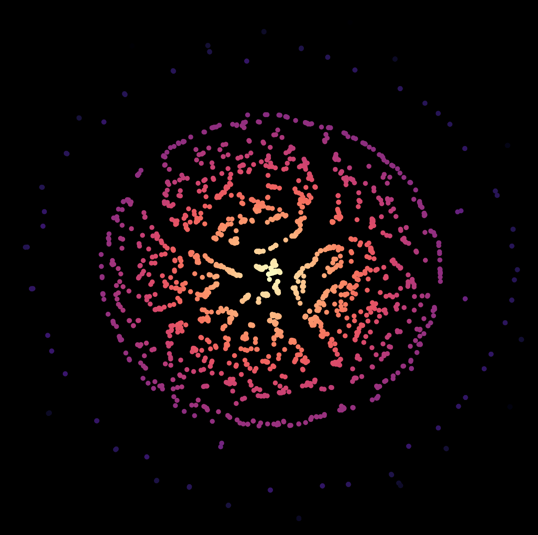
The Cell
The Dipole
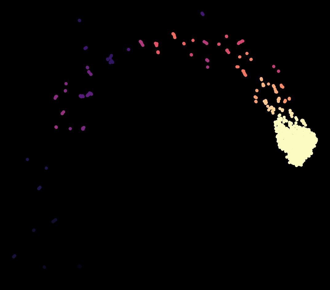
The Meteor
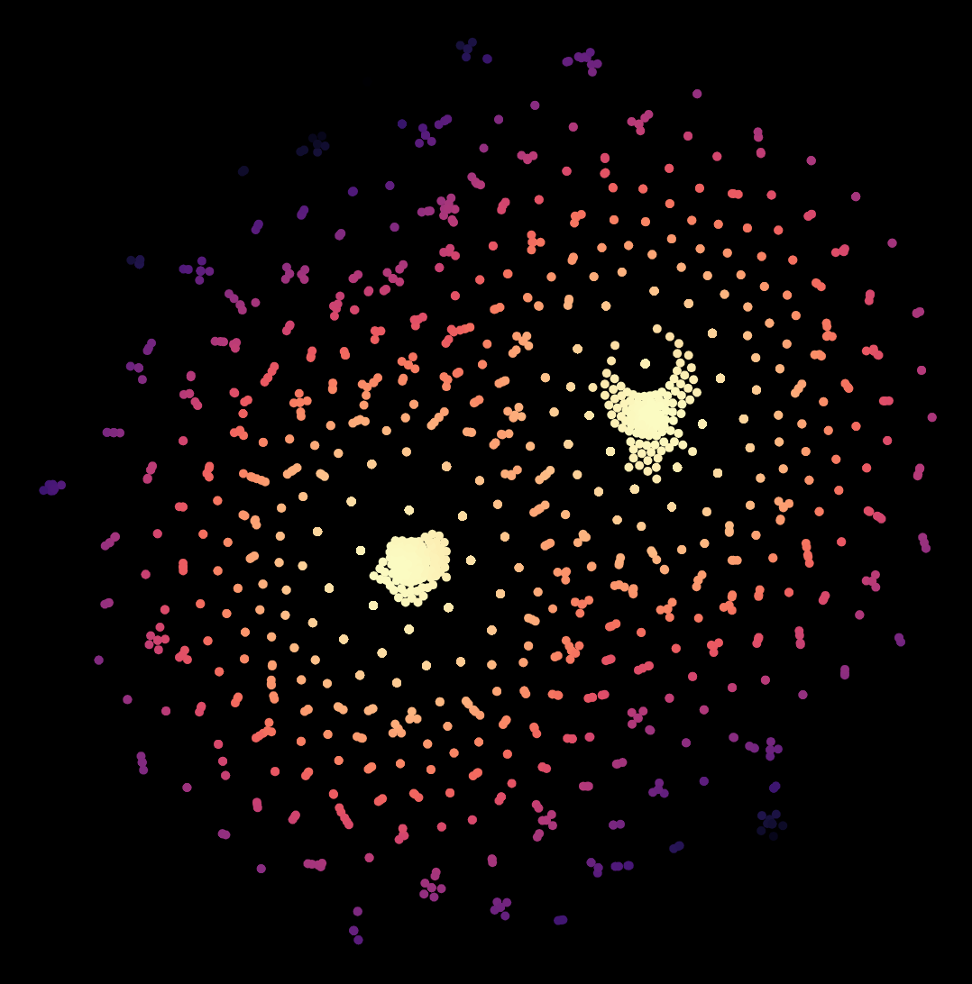
The Rabbit
Final Thoughts
What do you think? The main thing that surprised me about this is that these are all representations of the same underlying dataset! When I showed these to my mentors, they said that there is a little joke that if you spend long enough, you can get whatever you want in unsupervised learning.
Lastly, I think it is nice that while I am grinding away trying to determine what is the most valuable for my clients, I can get these little pleasant surprises on the side.