Stop and Search, Part III, Data Analysis
I finish this project by plotting various charts to summarise the data obtained in the previous two parts.
Total number of stops and searches
Grouped by ethnicity
I start by plotting the total number of stops and searches (since May 2017 because that is the earliest data of the dataset), grouped by ethnicity.
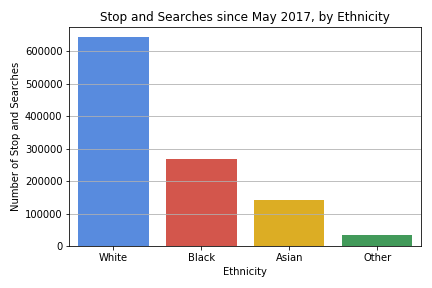
From this chart, a simplistic conlusion would be that white people are searched significantly more than other ethnicities, so there is no racism in the system. This is clearly bad reasoning, as we need to account for the underlying population.
Including population
Population data is taken from here. I use this data to produce the following chart. Note that I grouped the various numbers together in the same way I grouped ethnicities together in producing the ethnicities column.
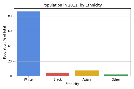
Now things look bad. There is clearly a discrepancy between the population and the number of stop and searches.
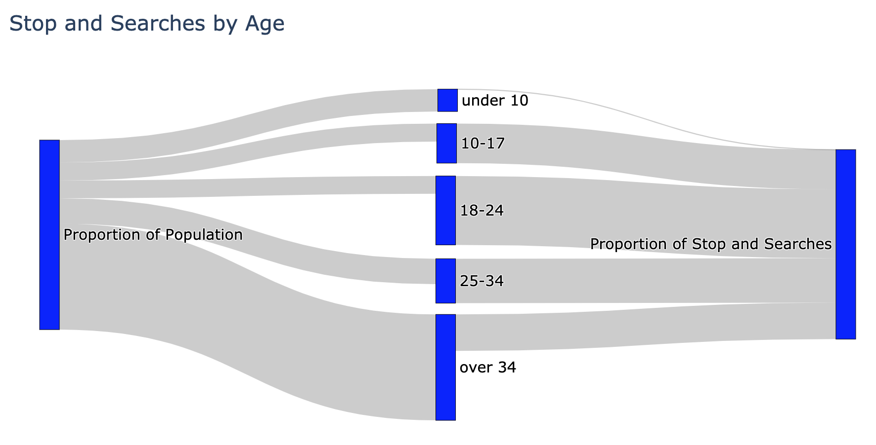
To visualise this discrepancy more clearly, I decided to create a Sankey diagram using Plotly.
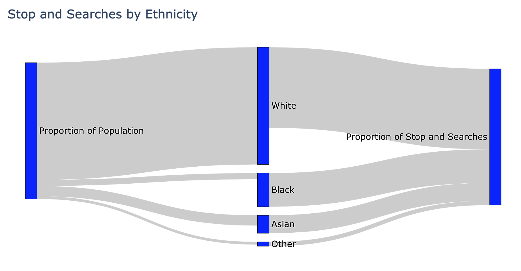
The diagram makes the discrepancy quite plain to see. Black people are stopped disproportionately more than other ethnic groups. There is evidently a big problem here.
However, and unfortunately, this diagram does not tell us where exactly the problem is. Is the problem with the police or is there a deeper problem? Are the police racist for stopping black people more often, or, is this a reflection of crime rates and the underlying social issues?
Some people would look at the above diagram and wonder how this is not conclusive evidence of police racism. To illustrate the idea, consider the following two charts:
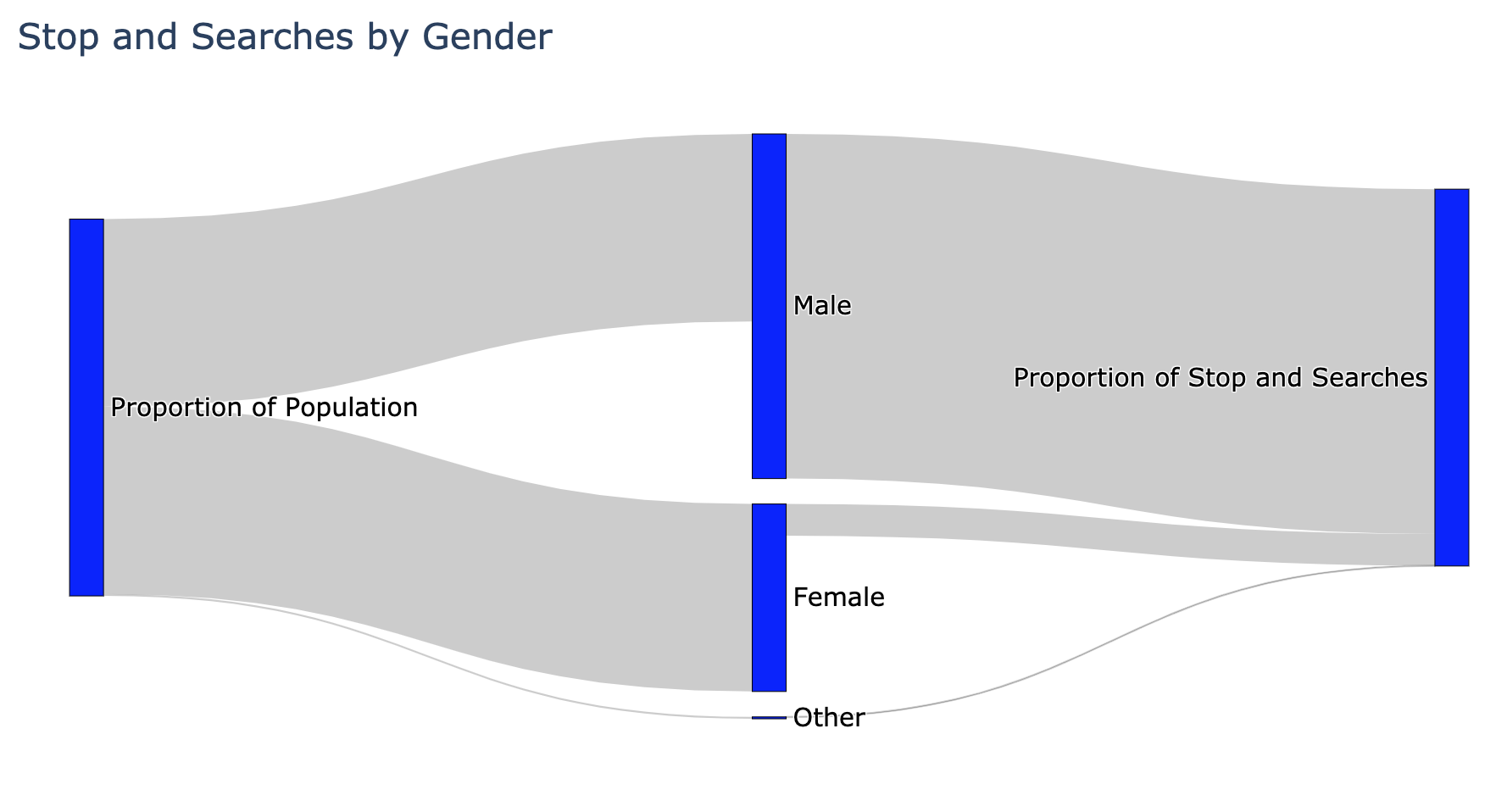
The majority of people would not look at these charts and conclude that the police are sexist or ageist, so one should not use the chart above for ethnicity to automatically conclude the police are racist.
To try to shed some light on the question of racism, I will take into account the outcome of the stop-and-search.
Including outcomes
The following stacked barchart shows the breakdown of outcomes for each ethnicity.
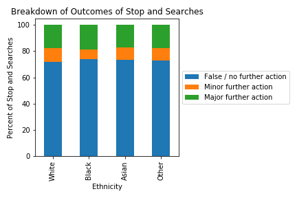
This is not at all what I was expecting. I was expecting to find that black people would have more false stop and searches than white people. It is shocking how consistent the ratio is across ethnicities - almost suspiciously so. There is some discrepancy if you look closely, but dramatically less than what the Sankey diagram above suggested.
Conclusions
My main goal for this was to gain some better understanding of crime data, and the process of cleaning and summarising data. To my surprise, it seems from this simple analysis that police stop-and-search is not inherently racist, but there is a high chance I have not accounted for something or that my process is over-simplistic. Of course, you should refer to more authoritative sources for conclusions on these complex issues, and not base your opinions on an amateur blog.
Some key lessons I learnt:
- I had to make some key decisions about how to group the data, namely, how to deal with discrepancy between officer and self defined ethnicity. In particular, it is not clear how one ought to group people of mixed race. Given how even the ratios were in the final chart, I don’t think this decision made a major difference, but it is something that I now know to consider when reading research in this area.
- Dramatically different stories can be told depending on how the data is presented. This is something I already knew, but this is the first time I have experienced creating the charts for myself. With great power, comes great responsibility.
- The quality of this analysis totally depends on the quality of the underlying data.
- I did not mention this before, but there are gaps in the data: there are some police forces who do not provide the data for every month. This does not affect my simplistic analysis, but it would matter for more nuanced analyses.
- The population data is from 2011, so there will be significant errors introduced by this mis-match between the datasets.
- I have to, and do, trust that the data provided is accurate. It is scary to think how easily a government could skew the data, or simply withhold it. Going through this experience lets me better understand the dystopia in 1984.
Code
Here I provide sample of the code used to produce the charts.
Below is the code to produce the first bar chart.
colours_255 = [(66, 133, 244,255), (234, 67, 53,255), (251, 188, 5,255), (52, 168, 83, 255)]

colours = [ tuple(n / 255 for n in colour) for colour in colours_255]

plt.figure
sns.barplot(x = sas_ethnicity.index, y = sas_ethnicity,
           order = ['White', 'Black', 'Asian', 'Other'],
           palette = colours)
plt.grid(True, axis = 'y')
plt.title('Stop and Searches since May 2017, by Ethnicity')
plt.xlabel('Ethnicity')
plt.ylabel('Number of Stop and Searches')
plt.tight_layout()
plt.savefig('sas3_sas_eth.png')
Here is the code to produce Sankey diagrams.
# create function that plots Sankey diagram given appropriate dataframe

def create_sankey(df, title):
    len = df.shape[0]

    fig = go.Figure(data=[go.Sankey(
    node = dict(
      pad = 15,
      thickness = 20,
      line = dict(color = "black", width = 0.5),
      label = ['Proportion of Population'] + list(df.index) + ['Proportion of Stop and Searches'],
      color = "blue"
    ),
    link = dict(
      source = [0]*len + list(range(1,len+1)),
      target = list(range(1,len+1)) + [len+1]*len,
      value = df.iloc[:,0].append(df.iloc[:,1])
    ))])

    fig.update_layout(title_text=title, font_size=15)
    fig.show()

# create dataframe containing population and stop and search data by ethnicity
sas_eth_pop = pd.DataFrame({'population': population, 'sas': sas_ethnicity, }, index = sas_ethnicity.index)
sas_eth_pop = sas_eth_pop.loc[['White', 'Black', 'Asian', 'Other']]
sas_eth_pop.sas = sas_eth_pop.sas/sas_eth_pop.sas.sum()*100


# create sankey diagram
create_sankey(sas_eth_pop, 'Stop and Searches by Ethnicity')
Here is the code to produce the stacked barcharts at the end:
# group data by ethnicity and outcome.
sas_eth_out = pd.DataFrame(sas.groupby(['ethnicity', 'outcome']).outcome.count())
sas_eth_out.rename(columns = {'outcome': 'frequency'}, inplace = True)
sas_eth_out.reset_index(inplace = True)

# convert frequencies into percentages
sas_eth_total = sas_eth_out.groupby(['ethnicity']).frequency.sum()
sas_eth_out['total'] = sas_eth_out.ethnicity.map(lambda eth: sas_eth_total[eth])
sas_eth_out['percentage'] = sas_eth_out.frequency / sas_eth_out.total * 100

# pivot table, and re-order the rows
sas_new = pd.pivot_table(sas_eth_out, values = 'percentage', columns = 'outcome', index = 'ethnicity')
sas_new  = sas_new.loc[['White', 'Black', 'Asian', 'Other']]

# plot the graph
sas_new.plot.bar(stacked = True)
plt.xlabel('Ethnicity')
plt.ylabel('Percent of Stop and Searches')
plt.title('Breakdown of Outcomes of Stop and Searches')
plt.legend(labels = ['False / no further action',
                    'Minor further action',
                    'Major further action'],
           loc='center left',
           bbox_to_anchor=(1, 0.5))
plt.tight_layout()
plt.savefig('sas3_outcome.png')