Analysing the movies I've watched, Part IV, Data visualisation
I produce various charts based on the data collected in previous blog posts. I only look at the data without joining with imdb data - that will be done next time.
Other posts in series
-
Analysing the movies I’ve watched, Part V, Data visualisation II
-
Analysing the movies I’ve watched, Part III, Joining the tables
Movies per year
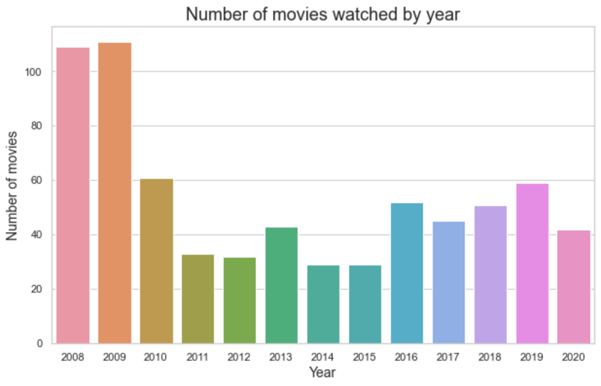
The most striking thing is how many movies I watched in 2008 and 2009! More than an average of 2 per week. The uptick in 2016 and 2017 can be explained by my mum buying me an Odeon Unlimited card in September 2016. The slight rise in 2018 and 2019 compared to mid 2010s I think is explained by moving into a house where watching movies was a common social activity for the housemates. And 2020 is significantly above average (given it is not complete), and this is explained by the covid-19 pandemic.
Movies by source
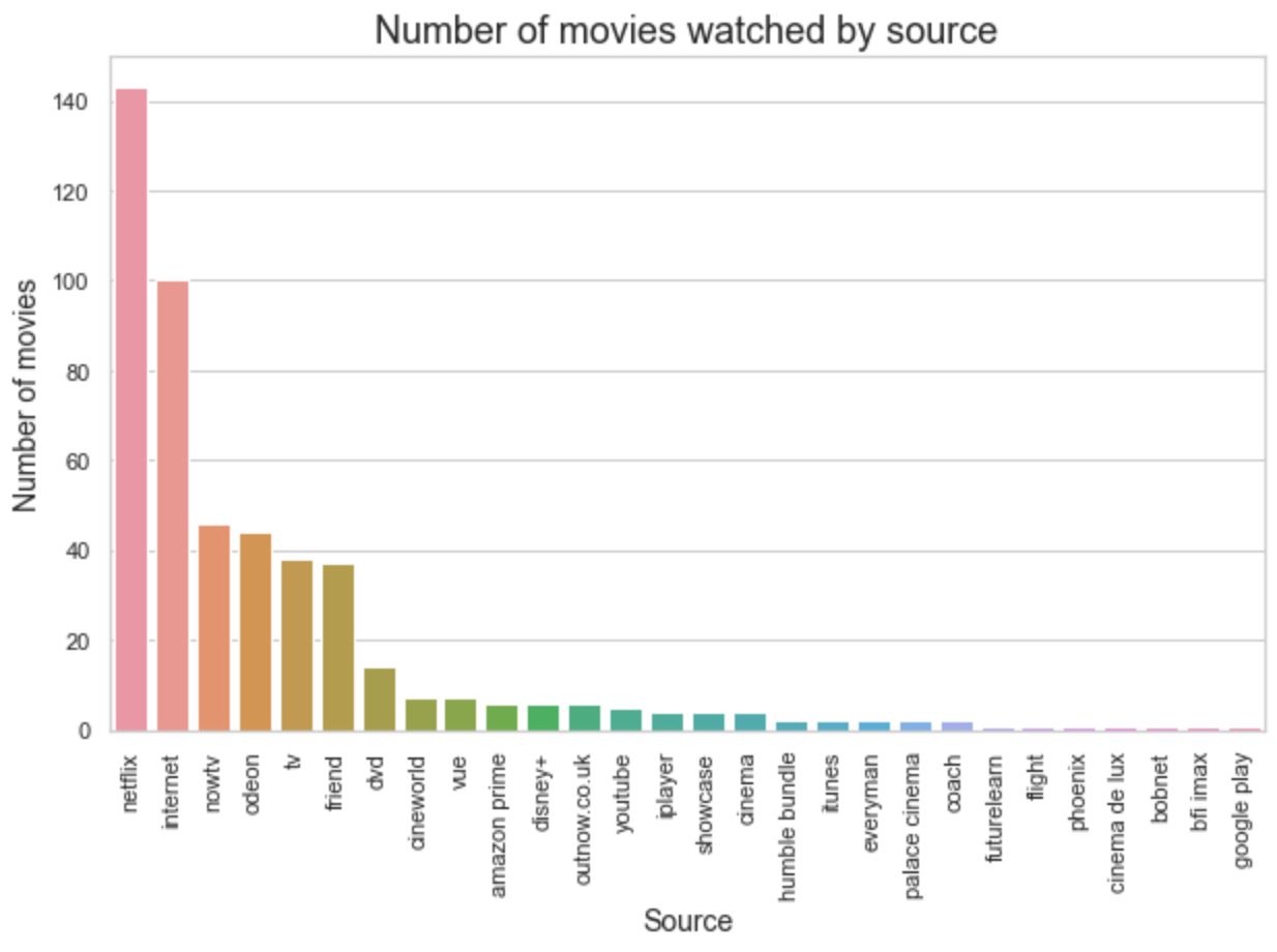
The majority of my movie-watching experience is done on Netflix. To help see any other patterns, I tried grouping them together:
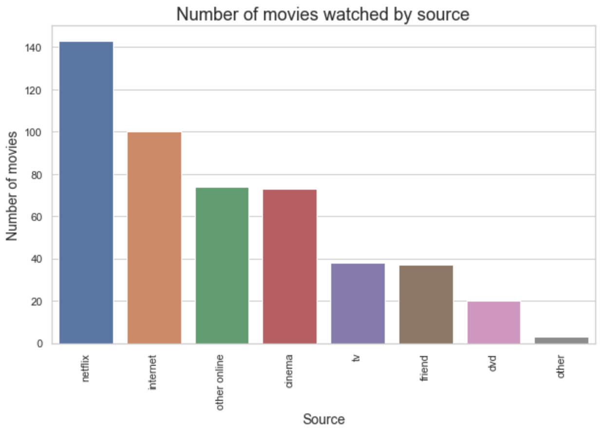
Not sure if there is anything noteworthy to say about this. Note that the category ‘internet’ may or may not refer to streaming from dodgy websites.
Movies by source and year
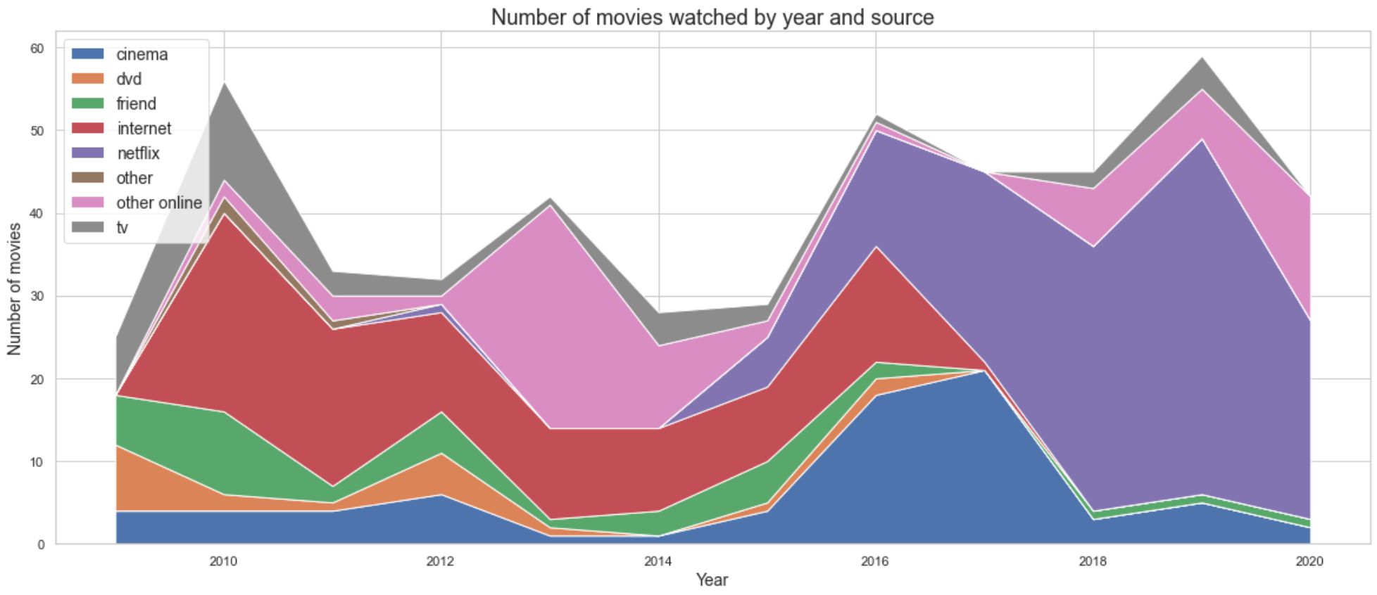
Stackplots are awesome! Visually striking, and provides an overall sense of how my movie watching habits changed. Some patterns which are clear from this diagram:
- There is a clear decline in the use of ‘the internet’ to watch movies in 2017.
- There is a clear rise in the use of Netflix, starting from around 2014.
- There is a big bulge in cinema viewings in 2016 and 2017, corresponding to when I had an Odeon Unlimited card.
- There is a big pink bulge, for a surge in ‘other online’ activity. A quick search in the dataframe shows this corresponds to me making a full use of free trials of NowTV.
Movies by month
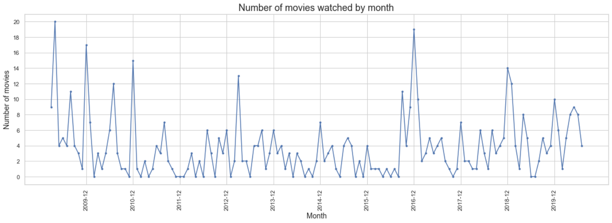
Again, there are some patterns visible in this plot:
- There are generally peaks in December, the holiday period! Looks like I enjoy watching movies when I am back home during the Christmas break.
- There are smaller peaks in several summer times, also likely due to me watching movies while at home.
- You can see some peaks at the end of 2016 and start of 2017, corresponding to the odeon unlimited card.
- You can see the increase in movie watching from March 2020, corresponding to covid-19.
I recently contributed to an open source project Darts, which does Time Series predictions. I was curious to see what patterns it would find. The following is obtained via an exponential smoothing:
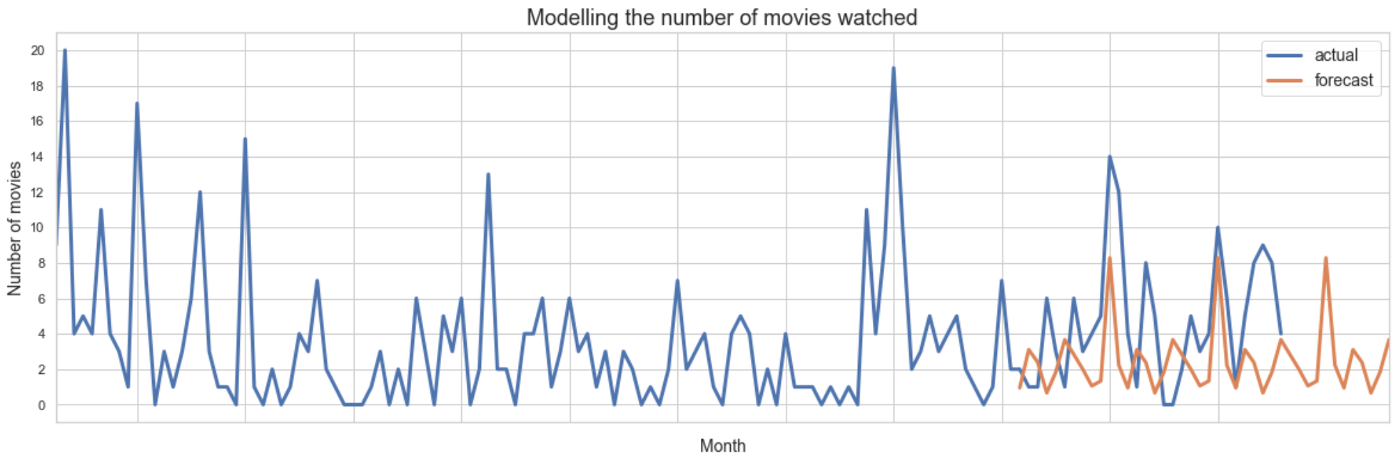
The clearest pattern in the model’s prediction is that it predicts peaks in December. Given how small and error-filled the dataset is, I do not think there is much to read in the smaller peaks at other times of the year.
Conclusions
Even with a dataset as noisy as this one, it is still possible to obtain some nice visuals and uncover some overall patterns. My favourite chart is the stackplot showing how the source used to watch movies has changed over the years.
Another nice thing about this project has been that it included various firsts for me: first stackplot, first time series model (admittedly basic), first pivotting in pandas (to create stack chart), first time grappling with Time formats to create precisely the plot I want (for the plot by month).
Next time, I will see what patterns there in the subset of data for which I could join it with imdb data.