Other posts in series
Introduction
In the previous post, I scraped squash ranking data and produced a dataframe out of it. I then simply eye-balled the table to see the patterns. However, doing some kind of visualisation is always better than just listing a table, so that is what I did next. Furthermore, I decided to finally try out some dimension reduction algorithms and clustering to help with the visualisations and pattern-finding.
Male Rankings
PCA
I first tried using PCA on the data.
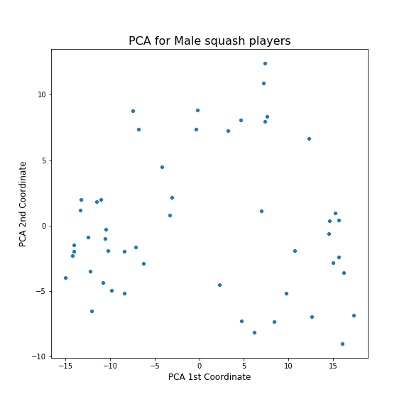
Hmm. Not sure what to make of this as it is. To better understand it, I visualised how this plots relates to the various features in the frame created in Part 1.
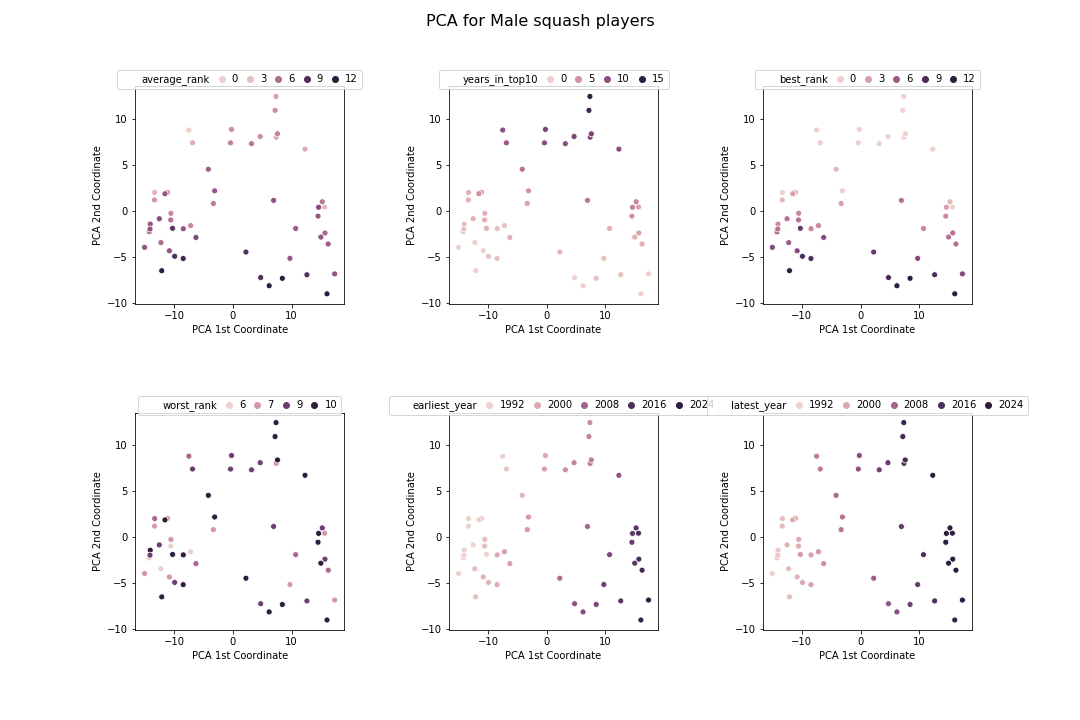
From this, I can better understand what is going on. The 1st PCA component is highly correlated with the years that the players played and the 2nd PCE component is correlated with rank.
tSNE
Next I tried tSNE.
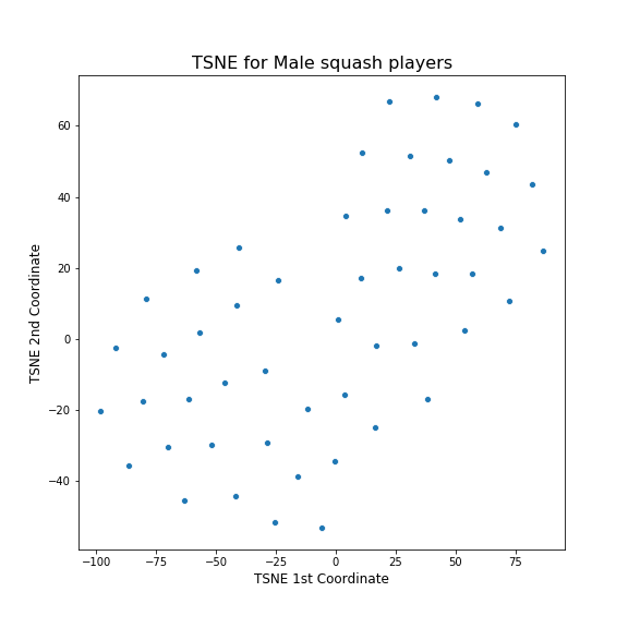
Hmm. This does not look good. It does not seem to have spotted any patterns and just created a grid of points. I suspected that maybe I have to change the parameters of tSNE, so I looked at the documentation. In the documentation, it said that a good choice of perplexity often depends on the size of the dataset, with larger perplexities working better with larger datasets. I had a small dataset so I tried setting small value of perplexity, 5, in comparison to the default of 30. The result is this:
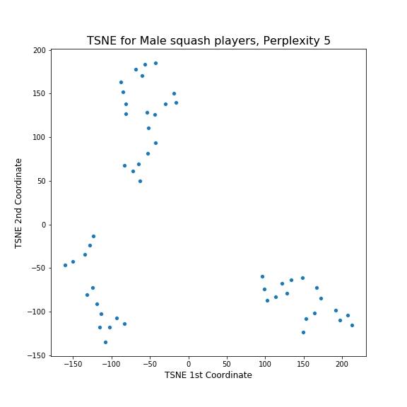
Hooray! Clearly the algorithm has found three distinct clusters in the dataset. To understand what these clusters correspond to, I again visualised how this plots relates to the various features in the dataset.
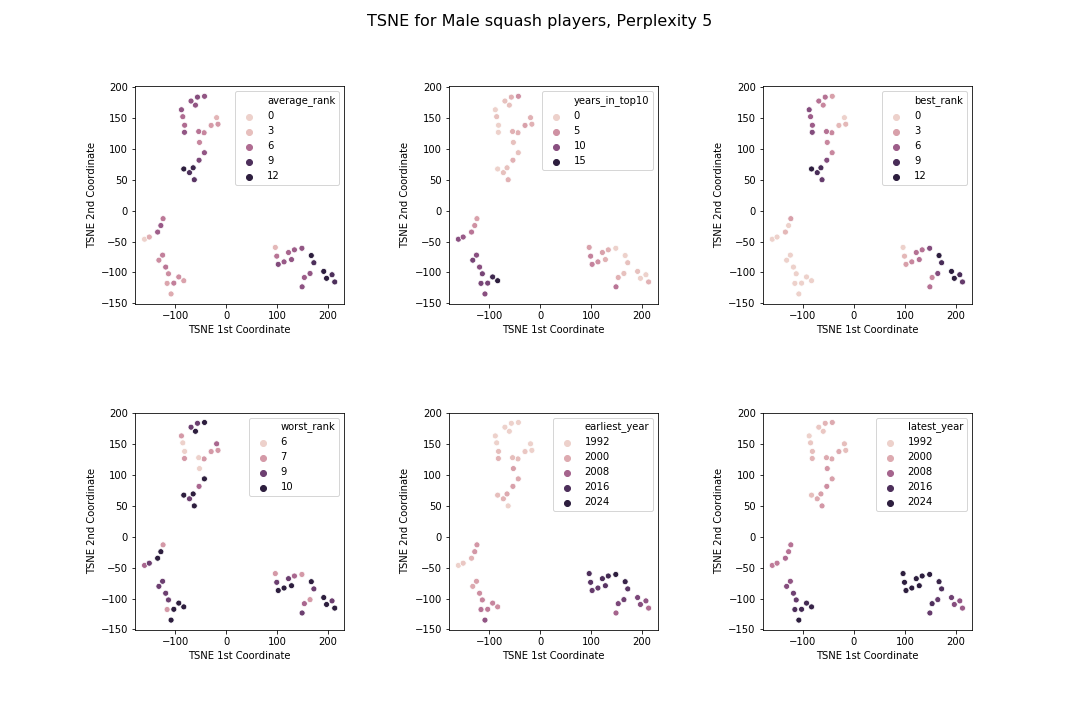
By looking at these charts, the clusters seem to have these patterns:
- The bottom left cluster corresponds to those players who have been in the top 10 longest
- The top cluster corresponds to those players whose career ended in the 90s or early 2000s
- The bottom right cluster corresponds to those players whose career has started quite recently
UMAP
Finally I tried UMAP.
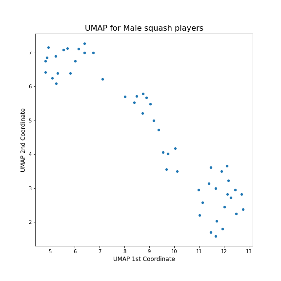
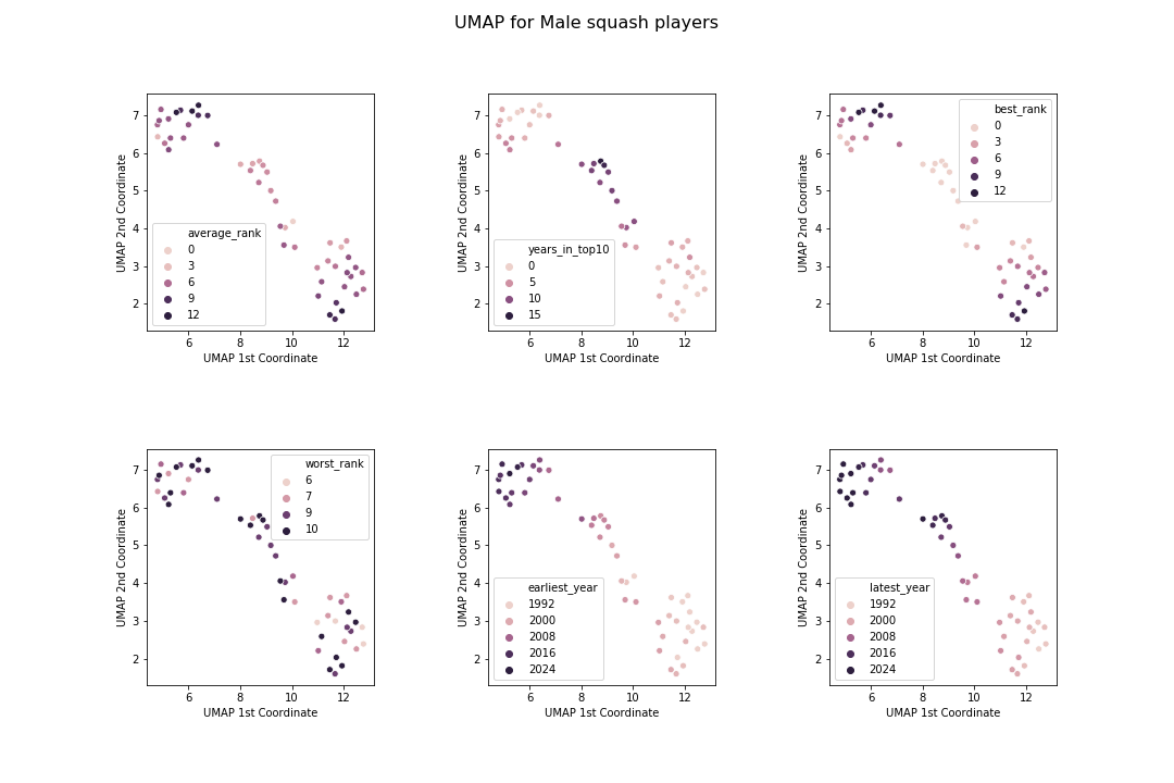
This is incredible! This has captured the same three clusters as tSNE, but has presented them in a more coherent way. Moving from top left to bottom right corresponds to going from younger to older players, with the chunk in the middle being the most successful players with good rankings and many years in the top 10.
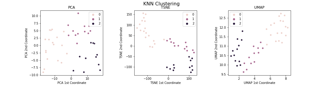
Clustering
Based on the above dimension reduction visualisations, the data fits into three clusters. Hence, I tried to identify those clusters by using k-means clustering on the original dataset (i.e. without any dimension reduction). I then visualised how those clusters look in the different dimension reductions:
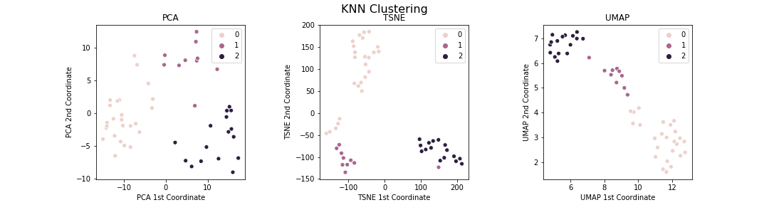
Woohoo! This is really pleasing. As my first experience using these tools, I do not know if I should be surprised or not to see that the different tools are overall consistent with each other. There are a couple of interesting subsets of players though.
- There are five cluster-0 players who seem to form their own cluster between cluster 0 and cluster 1. Doing a search in the dataframe reveals that these are players who ended their careers in late 90s/early 2000s but have been in top 10 for several years.
- There is a single purple cluster-1 player who seems better being treated as a cluster between cluster 1 and cluster 2. Again doing a search reveals that this is a player who has many years in the top 10 like the elite cluster-1 players, but who is not actully an elite player themselves (e.g. their top ranking is 5, whereas everybody in cluster 1 has reached world number 1 ranking).
Based on this single example, it looks like UMAP has the best representation of the data. PCA does not do a great job distinguishing the clusters strongly whereas tSNE forces things into clusters and does not allow for ‘grey’ areas in the space.
Female Rankings
Here are the analagous plots for female players.
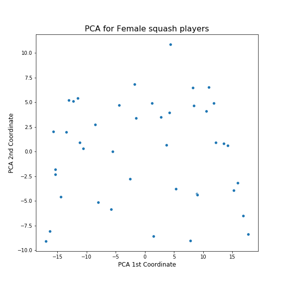
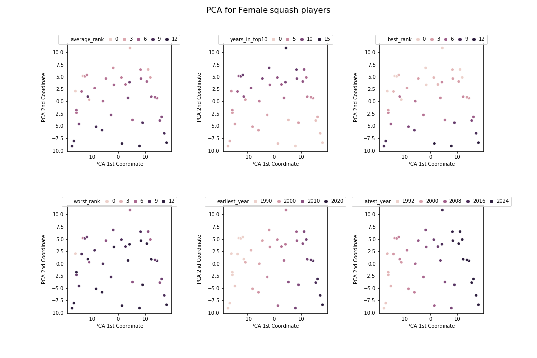
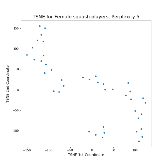
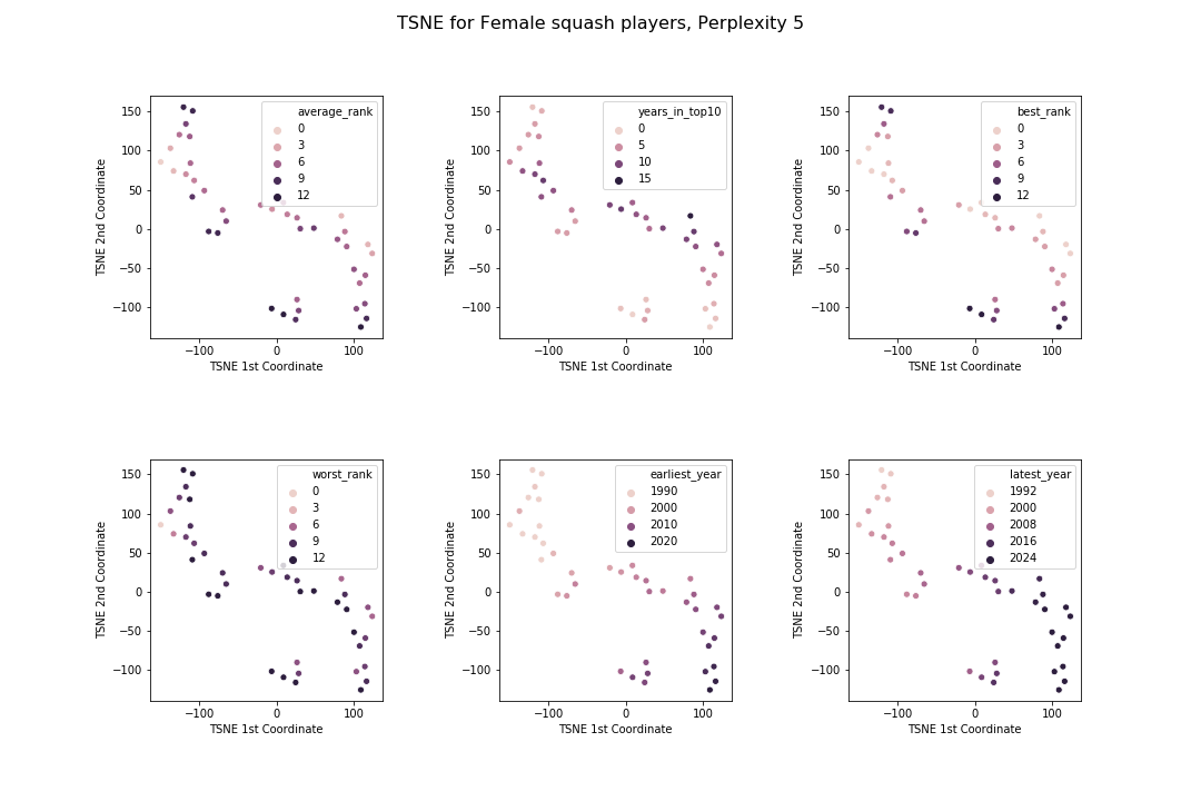
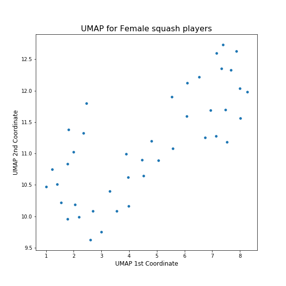
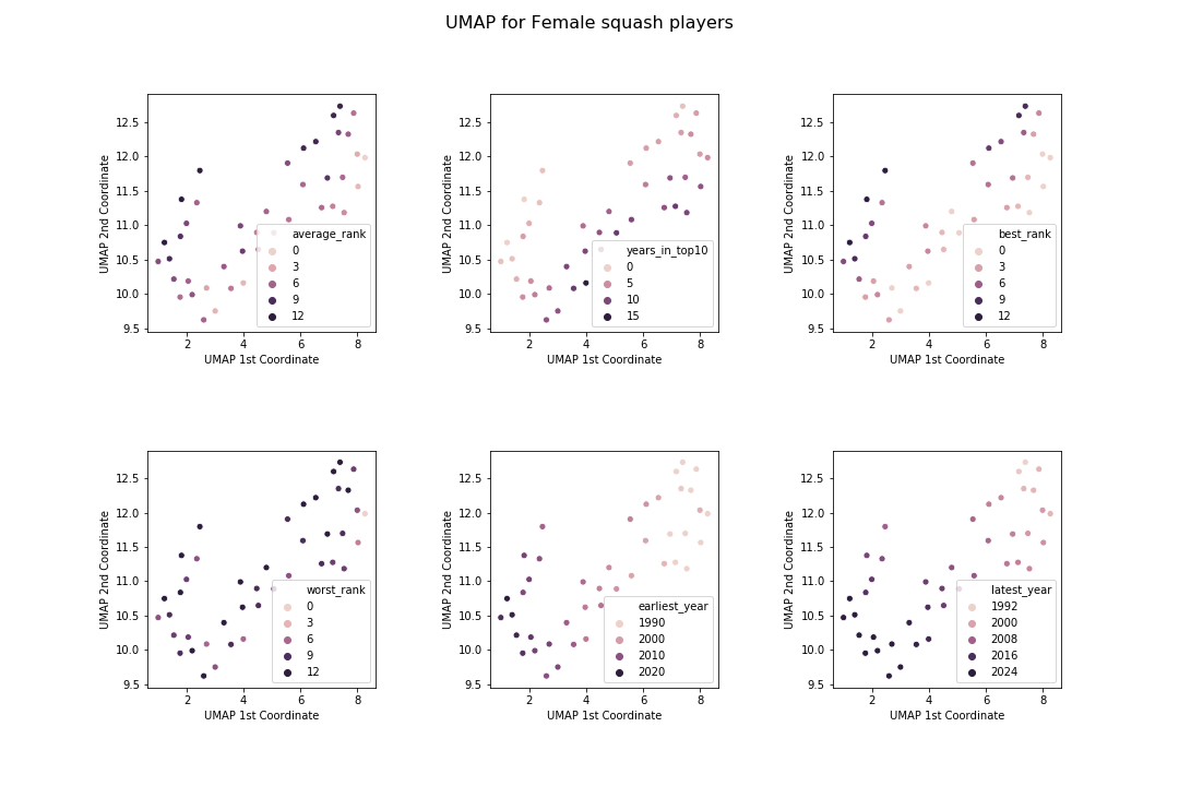
The patterns here are far less clear as for the mens. I guess I was correct to be surprised at how nicely things worked out earlier! However, the way the algorithms have organised the data is roughly similar: the two important characteristics of a player according to these algorithms are the years they played and their rankings in that time. Also, the clusters have been broken up into similar chunks: players with good rankings, older players and younger players.
Conclusions
Like I said at the start, this is my first experience using these techniques. The main takeaway for me is how cool (and useful) these algorithms are! Up till now I had only done supervised classification or plotted standard charts for EDA. However, having gone through this experience and got a basic feel what the algorithms can achieve, I will be sure to make more use of it in the future.