Other posts in series
-
Squash rankings, Part II, dimension reduction and clustering
-
Squash rankings, Part I, Scraping wikipedia and data analysis
Introduction
One of my mentors at the Faculty Fellowship, Sania Jevtic, recommended I try using Bokeh to plot various charts I was making. I tried it and without too much effort I managed to get it to work. It is AMAZING! The interactivity you get from it is fantastic and allows for much easier understanding of your data and richer presentation of your data. I will try to illustrate by redrawing some of the charts from Part II of this series.
I will be re-making the three charts below:
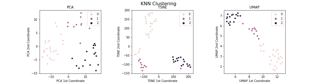
Recall that the colours are clusters made by doing k-mean clustering on the original dataset, not doing clustering on each of the dimensionally-reduced datasets.
Bokeh charts
So what’s so amazing about these? They look basically the same. The big advantage is in their interactivity! Try hovering your mouse over the points. What happens?
Cool, right! I can’t stop being amazed at this. It makes the chart so much more informative and greatly aids in data exploration. For example, I can now just hover over the anomalous orange dot to find out what is going on: it is Peter Barker who has had a long successful career like the other orange dots, but has never actually reached the top few spots in the world rankings like the green dots. Another example is that I can understand some of the nuanced structure in the charts and find sub-clusters. For example, in the PCA diagram, the four points that are the highest in the green cluster form a sub-cluster of the players Ali Farag, Karim Abdel Gawad, Tarek Momen and Simon Rosner, who are excellent players who are consistently in the Top 5, but not legendary. (Ali Farag is an exception to this - he will undoubtedly join the orange cluster but his career is too short at the moment to join the cluster of elite players).
Conclusion
Bokeh is amazing! This is what I managed to do after less than an hour of Googling around and adapting examples. If you look at the documentation, there is a whole load of other things that are possible, e.g. different kinds of interactivity.
I highly recommend you try using it.
Code
Below is a sample of the code to illustrate how to create the Bokeh plots above.
# import packages
from sklearn.manifold import TSNE
from sklearn.cluster import KMeans

from bokeh.plotting import figure, output_notebook, show, save, ColumnDataSource
from bokeh.models import HoverTool, CategoricalColorMapper
from bokeh.palettes import d3
from bokeh.transform import factor_cmap
output_notebook()

# use tsne to do dimension reduction
tsne_model = TSNE(n_components=2, perplexity = 5, random_state = 0)
male_tsne = tsne_model.fit_transform(players_m)

# use kmeans on original dataset to determine clusters
kmeans = KMeans(n_clusters=3, random_state=0).fit(players_m)

# create the bokeh plot
source = ColumnDataSource(
    data=dict(
        x=male_tsne[:, 0],
        y=male_tsne[:, 1],
        clusters = [f'{i}' for i in kmeans.labels_],
        players=players_m.index,
        best_rank=players_m.best_rank,
        years_in_top10=players_m.years_in_top10,
        earliest_year=players_m.earliest_year
    )
)

palette = d3['Category10'][3]
color_map = CategoricalColorMapper(factors=[f'{i}' for i in range(3)],
                                   palette=palette)

TOOLS="box_zoom,hover,reset"
p = figure(title="PCA of Male Squash Player Rankings", tools=TOOLS)
p.background_fill_color = "white"
p.xgrid.grid_line_color = None
p.ygrid.grid_line_color = None

p.scatter(x='x', y='y',
          color={'field': 'clusters', 'transform': color_map},
          source=source)

hover = p.select(dict(type=HoverTool))
hover.tooltips = [
    ("Player", "@players"),
    ("Best rank", "@best_rank"),
    ("Years in Top 10", "@years_in_top10"),
    ("Earliest year", "@earliest_year")
]

show(p)
save(p, filename = 'squash3_malepca.html')