Other posts in series
The hand-made model
Given the training data, for each feature, I compute the mean of that feature amongst all fraudulent transactions and the non-fraudulent transactions. For example, the mean value of the transaction was $124 for fraudulent transactions and $88 for non-fraudulent transactions.
Then, given some unseen transaction, I ask how many of its features are closer to the fraudulent mean or non-fraudulent mean. For example, if the value of a transaction is $115, then it is closer to the fraudulent mean of $124, so this is evidence the transaction is fraudulent.
And that’s it! This is not sophisticated at all, but I am interested to see how much information is contained in the means, and more importantly, how much information is gained by using more sophisticated models like Random Forests and XGBoosts.
Results
Below is the precision-recall graph for the model.
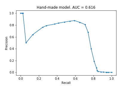
The AUC score is not great, only 0.616, but the model manages to identify ~70% of fraudulent claims with a precision of 0.8, which is not too bad!
At the end of the previous post, I said I hoped to achieve a score of 0.7. To do this, I just flattened the above precision-recall curve, by grouping together all the ‘high probability’ transactions (see code for explicit details). See the new curve:
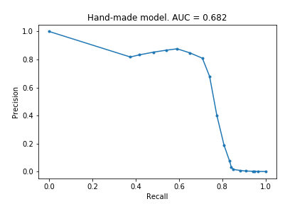
An AUC of 0.68! Not quite 0.7, but not too shabby.
Final thoughts
There are several ways one could easily improve this model. One example is that I weighted each of the features equally, but some features ought to be more weighted than others. Another example is that I did not consider how much closer a value was to the fraudulent mean compared to the non-fraudulent mean. There are many more possibilities. However, all of these are just the initial steps to creating one of the standard models - this hand-made model is just a (bad) Random Forest after all!
Doing this hands-on modelling has been quite satisfying. Though Random Forests and XGBoosts produce much better models, they did not actually teach me anything. Of course, one big reason for this is that I do not yet know how to extract information from those models - I have only learnt how to create them. Even so, there is something immediately tangible in the simplicity of this hand-made model: 70% of fraudulent transactions follow the average trends of previous fraudulent claims. Though I am prepared to be wrong, I doubt the insights from XGBoosts will be as easy to formulate as that!
The code
# import modules
import numpy as np
import pandas as pd

from sklearn.model_selection import train_test_split

from sklearn.metrics import precision_recall_curve
from sklearn.metrics import auc
from matplotlib import pyplot as plt


# import data and create train_test split
data = pd.read_csv("creditcard.csv")
y = data.Class
X = data.drop(['Class'], axis = 1)
Xt, Xv, yt, yv = train_test_split(X,y, random_state=0)


# calculate means for fraudulent and non-fraudulent claims for training data
data_t = pd.concat([Xt, yt], axis = 1)
means = data_t.groupby('Class').mean()
means_mid_point = (means.loc[0] + means.loc[1])/2


# create function to create predictions
def make_prob(row):
    prob = 0
    for col in row.index:
        if (row[col] > means_mid_point[col]) and (means.loc[1, col] > means.loc[0, col]):
            prob += 1
        elif (row[col] < means_mid_point[col]) and (means.loc[1, col] < means.loc[0, col]):
            prob += 1
    return prob/30


# create predictions, calculate AUC and plot PRC
preds = Xv.apply(make_prob, axis = 1)
precision, recall, _ = precision_recall_curve(yv, preds)
auc_handmade = auc(recall, precision)

plt.plot(recall, precision, marker = '.')
plt.xlabel('Recall')
plt.ylabel('Precision')
plt.title(f'Hand-made model. AUC = {auc_handmade:.3f}')
plt.savefig('creditcard_3_handmade')


# tweak predictions to 'flatten the curve'
preds2 = []

for pred in preds:
    if pred > 0.7:
        preds2.append(0.8)
    else:
        preds2.append(pred)