Other posts in series
Summaries
Part I
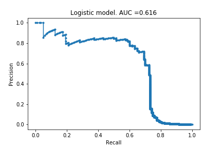
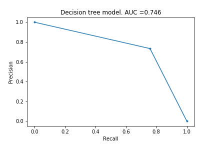
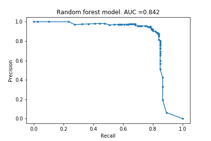
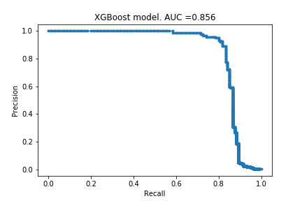
In Part I, I described the framework and created the first set of models using default settings. I tried logistic regression, decision tree, random forest and xgboost models, and they respectively achieved an AUPRC of 0.616, 0.746, 0.842 and 0.856. Since then, I have learnt about more models and if I were to do this project again, I would also have included a support vector machine model and a k-nearest-neighbour model.
Part II
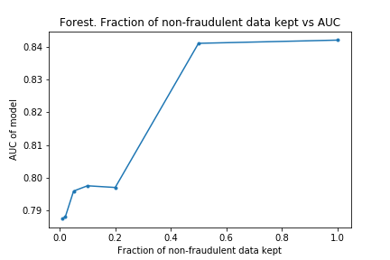
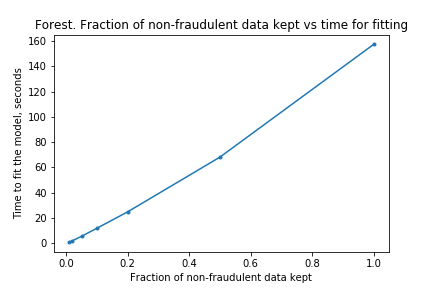
In Part I, it look some time to fit the models, the forest model in particular, and I wanted to do some hyper-parameter optimisations. I wanted to find out if I could reduce the time taken to fit by removing non-fraudulent claims. The results of the experimentation showed that the time to fit was proportional to the size of the training data set, but the AUPRC did not take a massive hit. This is good because it means I can do more hyper-parameter optimisations than before.
Part III
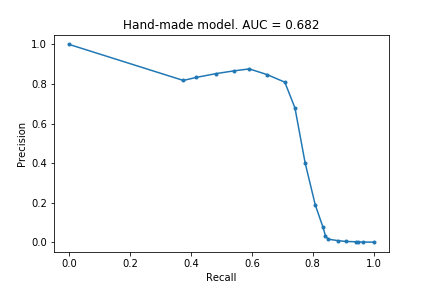
Though the models were able to identify fraudulent transactions, I had gained no understanding. I tried creating a simple model: for each feature, determine whether the value is closer to the fraudulent mean or the non-fraudulent mean. This achieved an AUPRC of 0.682 and was able to identify about 70% of the frauduluent claims. This was satisfying, and better lets me appreciate what is gained by using more sophisticatd models.
Part IV
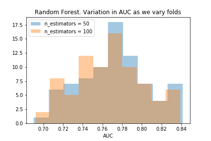
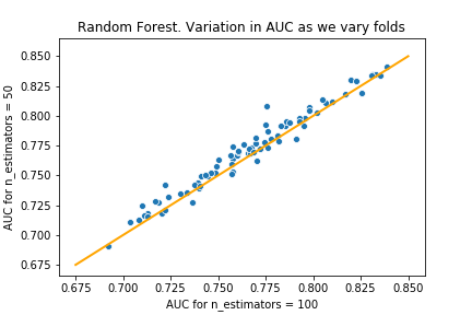
I started doing some hyper-parameter optimisations on the forest model, and noticed the AUPRC varied a lot between the different folds. I decided to investigate how the AUPRC can vary, to better appreciate what is gained by choosing one hyper-parameter over another. After doing this, I could confidently say that choosing 50 estimators is better than the default of 100 estimators.
Part V
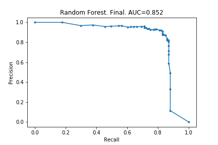
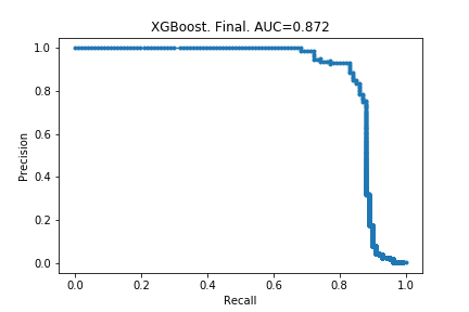
Here I actually carry out the hyper-parameter optimisations, and train the final models. The random forest’s AUPRC increased from 0.842 to 0.852, and the xgboost’s AUPRC increased from 0.856 to 0.872. Modest gains, and from the few articles I have read, this is to be expected.
Lessons learnt from Kaggle
I had a skim through the several most up-voted kernels on Kaggle. Below are the the things I found out by doing so. There is a lot for me to learn!
AUROC versus AUPRC
Many of the examples (including the most upvoted example!) use AUROC instead of AUPRC. The main reason this surprised me is that the description of the dataset recommended using AUPRC; I suppose there was an advantage to not knowing much before hand! The second reason this surprised me is that AUPRC is a more informative measure than AUROC for unbalanced data. I try to explain why.
The PRC and ROC are quite similar. They are both plots that visualise false positives against false negatives.
- False negatives are measured in the same way in both plots, namely, using recall/true positive rate. Recall tells you what percentage of truly fraudulent transactions the model successfully labels as fraudulent. (And so 1 - Recall measures how many false negatives we have, as a percentage of truly fraudulent claims.)
- False positive are recorded differently in the two plots.
- In PRC, precision is used. This is the percentage of transactions labelled as fraudulent that actually are fraudulent. Equivalently, 1-PRC is the number of false positives expressed as a percentage of claims labelled as fraudulent.
- In ROC, the false-positive rate is used. This is the number of false positives expressed as a percentage of truly non-fraudulent transactions.
To make this more concrete, lets put some numbers to this:
- Imagine there are 100100 transactions altogether, 100 which are fraudulent and 100000 which are not.
- Suppose a model predicts there are 200 fraudulent claims, and further suppose 50 of these were correct and 150 of these were incorrect.
- For both PRC and ROC, the true positive measurement would be 50%: 50% of the fraudulent claims were found.
- For PRC, the false positive measurement is 75%: 75% of the claims labelled as fraudulent were incorrectly labelled.
- For ROC, the false positive measurement is 0.15%: only 0.15% of the non-fraudulent claims were incorrectly labelled as fraudulent.
In short, ROC is much more forgiving of false positives than PRC, when we have highly unbalanced data.
I have also decided to plot PRC and ROC for a couple of the models in this series of posts, so you can visually see the difference. (Note that I have rotated the ROC curve to match up the variables with the PRC curve, so the comparison is easier.)
PRC and ROC for the final XGBoost model
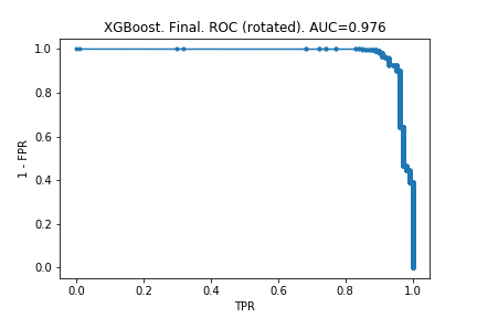
ROC makes the model look much better than PRC does. And it is deceiving: one might look at that second chart and say we can identify 90% of fraudulent claims without many false positives.
PRC and ROC for the handmade model
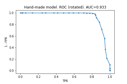
Here, the effect is far more dramatic and very clearly shows how unfit AUROC is for unbalanced ata.
Under- and over-sampling
It turns out my idea from Part III, to remove non-fraudulent data, has a name: under-sampling. However, it sounds like there is an expectation that under-sampling could actually improve the performance of the models. This is surprising to me; unless you are systematially removing unrepresenative data, how can the model improve with less information?! A quick skim of the wikipedia article suggests I have not completely missed the point: ‘the reasons to use undersampling are mainly practical and related to resource costs’.
Over-sampling looks like an interesting idea, in which you create new artificial data to pad out the under-represented class. Some people on Kaggle used SMOTE, where you take two nearby points, and introduce new points directly in between these two points. Something to keep in mind for future!
Removing anomalous data
A simple idea: try to find entries in the training data that are not representative and remove them to avoid skewing the models / to avoid over-fitting. Based on my limited understanding, I think tree-based models are not sensitive to extreme data (in the same way the median is not sensitive to extreme data), so this particular idea is unlikely to have helped me improve the models for this example. However, this is another tool I will keep in mind for future projects.
Dimensionality reduction and clustering
An interesting idea: try to find a mapping of the data into a smaller dimension that preserves the clusters. The algorithm somebody used was t-SNE which is explained in this YouTube video. A couple of other algorithms used were PCA and truncated SVD. I do not yet understand how I could use this to improve the models (in the example, this was done to give a visual indication of whether frauduluent and non-frauduluent data could be distinguished).
Normalising data
Useful idea I should always keep in mind! Again, I don’t think this matters for tree-based models, but something I should keep in mind.
Outlier detection algorithms
One person used a bunch of (unsupervised?) learning algorithms: isolation forests, local outlier factor algorithm, SVM-based algorithms. More things for me to learn about!
Auto-encoders and latent representation
This person used ‘semi-supervised learning’ via auto-encoders. This was particularly interesting, especially because they had a visual showing how their auto-encoder was better at separating fraudulent and non-fraudulent data than t-SNE. This is definitely something for me to delve deeper into some time, especially because of how visually striking it is.
Visualising the features
Here and here are examples of a nice way of visualising the range of values of each feature for frauduluent and non-frauduluent data. The key thing is that they normalised the histograms, but I am not sure how they did that. Something for me to learn!
GBM vs xgboost vs lightGBM
This kernel compared three algorithms. I quite liked this because it felt historical, and helps me appreciate how the community learns. The person compared the accuracy and time taken for each of the algorithms, and also describes some new settings and options they recently discovered.